Alien Adventures
Find the perfect adventure for your next holiday
Alien Adventures Website
Introduction
Do you often have wanderlust? Do you often get an itch to pack the bags and travel? Do you feel indecisive about picking the vacations and then figuring out what activities to do once you're there? Alien Adventures is here to help. Alien Adventures, now AlienAdv, is a platform to discover and book unique adventurous experiences. If you are an active person, they will make sure to find the best active holidays in the world for you. Whether it is hiking through the snow to meet nomadic tribes in the Himalayas, learning to surf in crystal blue waves of Bali or exploring the savannah on horseback, like the adventurers of legend, AlienAdv connects people to unique adventures, across the world.

My involvement
I was approached by my friends to help them streamline their product execution. They had all the wild ideas, I had to bring them into clarity using design. As a contributor, I designed their customer facing websites for mobile and desktop, including user-flows, and information architecture. I also did the information architecture, user-flows, and prototypes on InVision for their website for tour operators, and activity partners.
Key results
We decreased the rates of drop-off from the home page dramatically, with just basic information architecture and layouts. With the simplified and refined user-flows, we saw an increase in the number of unique visitors to other parts of their website, who landed through social media, and blog posts. These unique visitors also were the first people to send queries and quotation requests from the website about potential vacations.
Before this, AlienAdv didn't have any platform for tour operators and activity partners to list activities and connect with prospective customers. This operation was manual undertaken by the people at AlienAdv and was not a scalable, nor sustainable system. I worked with the team to build the platform from scratch, opening one more segment for the company to scale. This platform, paired with the customer facing website, allowed the company to become profitable within 10 months of its launch 🎉
Process
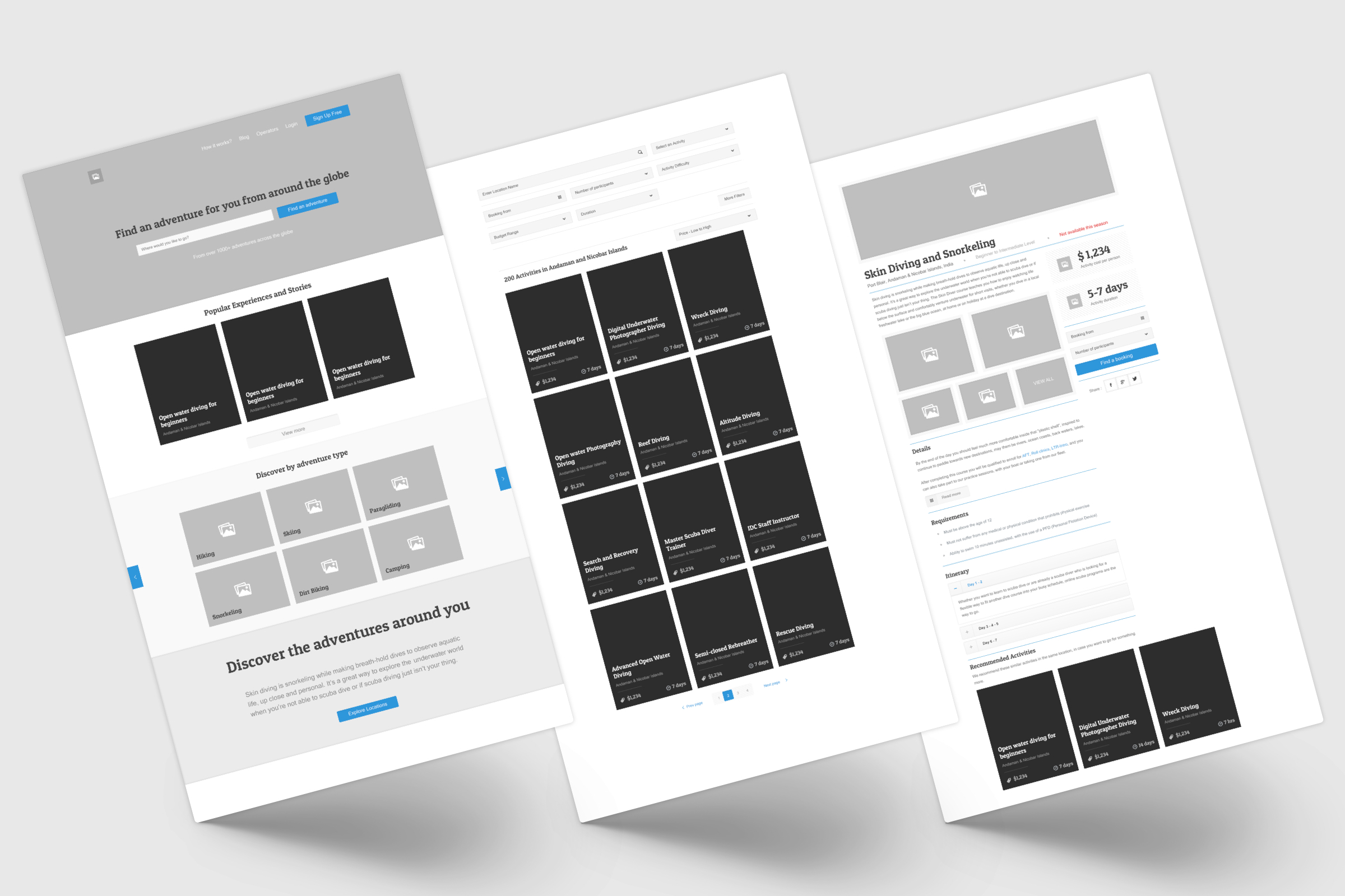
We had two primary users to solve for - consumers (people who are tourists) and partners (people who are operators). We wanted to solve for the consumer first, to understand what all particulars would be needed by a person browsing tourism activities to make an informed decision and make a booking. We started off by defining the information available, required, and to be used. The basic architecture and layout was done in wireframes to converge on the amount of details that people would fine useful and necessary. We put the wireframes to test in InVision for user-flows and task successes.

Early wireframes for Home, Activity listing, and Activity details
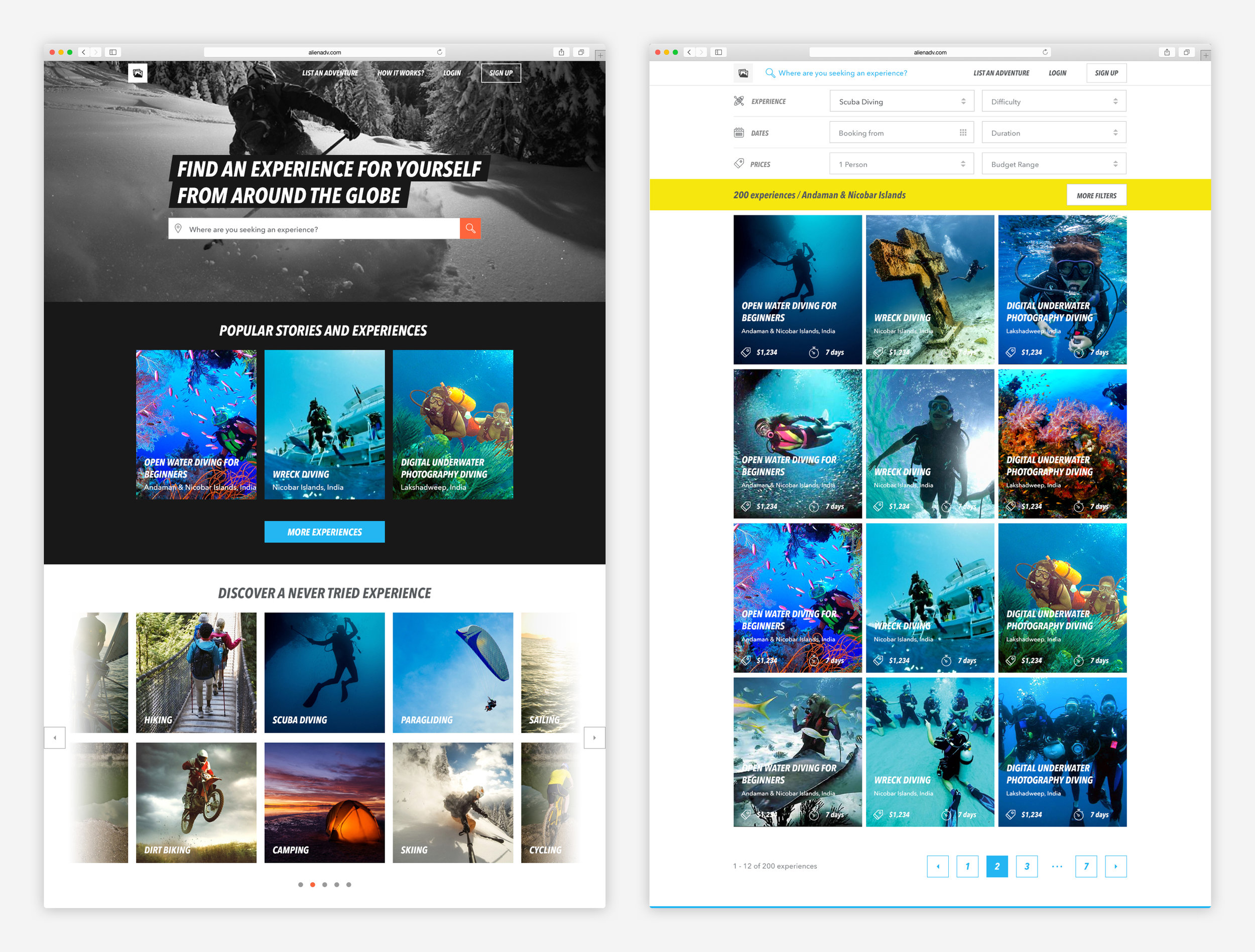
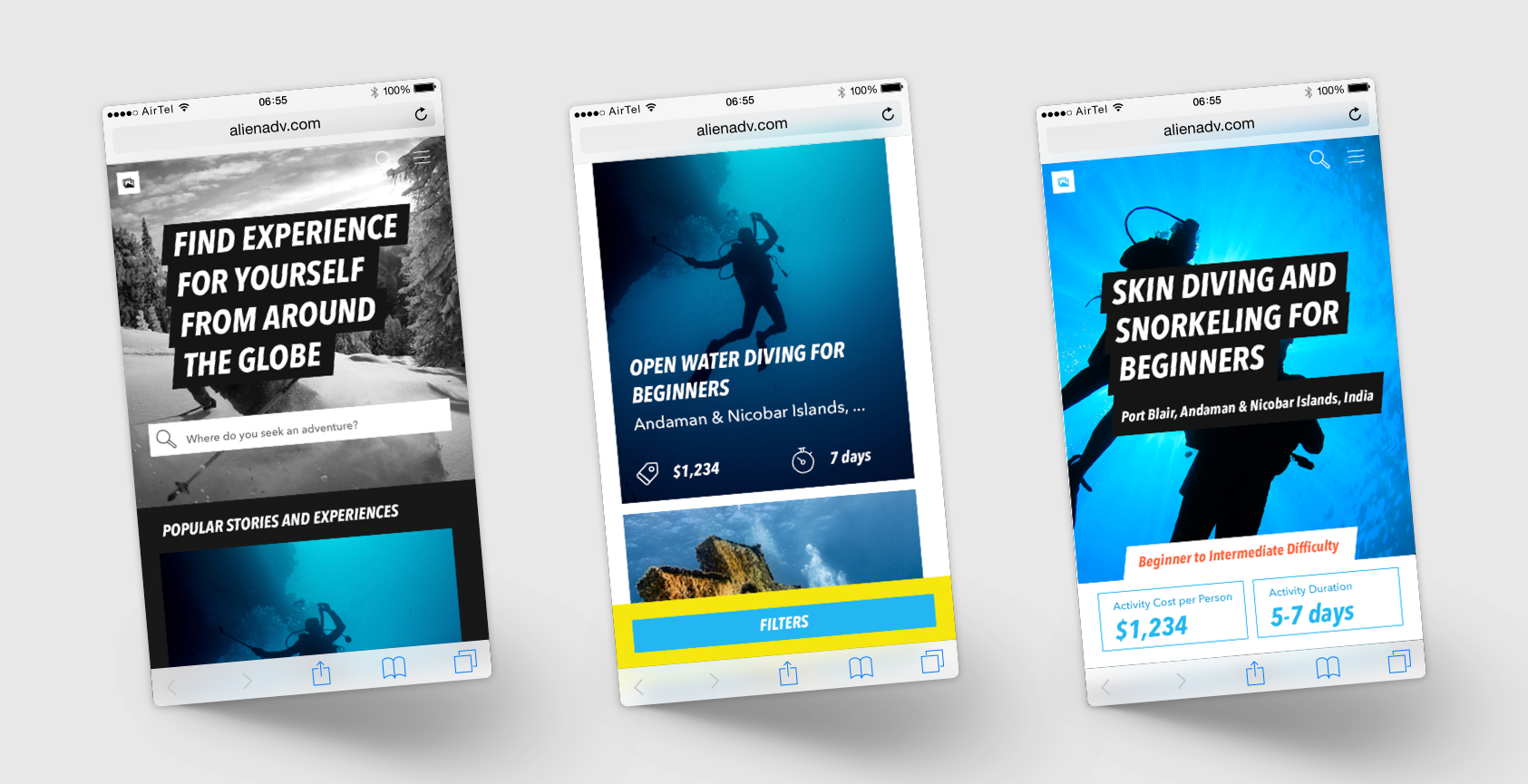
With the tests, we figured that our primary consumers would be consuming the website more in a desktop rather than a mobile or tablet. People were inclined to have a richer experience when they are looking for activities to do as a tourist - this made us invest heavily in full-bleed and bold images. We also put the checkout user experience on a lower priority and optimised this feature for a desktop experience. The learning to support this decision was that people usually took a lot of time in making similar decisions to plan vacations. Paying and booking was naturally a very hesitant step in the user journey and hence not preferable to do on a mobile.
We also decided to avoid any fancy transitions, but rather let the full-bleed images take the focus with bold typography.

Final versions for Home, and Activity listing

Mobile versions for Home, Activity listing, and Activity details
We also did an extensive exercise to create the partner platform. My part in this process was limited to initial research, information architecture, and wireframe testing with the partners. This system was robust and enabled about 100 partners across India and South East Asia to come onboard, and start uploading their activity listings, within the first month of putting it out on the market.

Wireframes for Creating a new activity, and Making a new booking by the operators